In this module we present controls that facilitate moving through color spaces, including alternative purity scales, combinations of hues, and monochromatic space.
Purity space
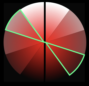
The space that we call purity space actually represents a two dimensional color space that includes saturation and brightness. We have collapsed the two into a single space both because that is how artists have thought and spoken about it for over a century and because it makes playing colors considerably more manageable.
The mapping we provided in an earlier module, where you move through saturation space at one end and brightness space at the other (holding the other constant in both cases), was inspired by Thomas Cole’s Diagram of Contrasts. But, there are other ways to draw a line through the two-dimensions of saturation and brightness. While the number of potential combinations is infinite, it is possible to cover the space quite effectively by providing three mixes of saturation and brightness that are intermediate between the pure saturation and pure brightness represented in Cole’s purity.
This capability is implemented in two semi-circular controllers, coded in the files LeftPuritySelector and RightPuritySelector. They can be moved by swiping up and down or by tapping. Together they provide twenty-five ways to configure the purity ribbon.
Color chords
Colors appear together and no color is ever really seen alone. When seen by the human eye, colors appearing together affect one another. The law of simultaneous contrast, the way in which colors affect the appearance of near-by colors, has been a subject of research since M.E. Chevreul identified it in the early 19th century. The hue chord selector is used to establish relationships among up to eight “notes” based upon intervals between hues. These can affect both backgrounds, and lumis, or drawing objects.
Code establishing the relationships is in the file ColorModel.
    let hueDisplacements:[[Double]] = [
         [0.0, 0.0, 0.0, 0.0, 0,0, 0.0, 0.0, 0.0],               // single hue
         [0.0, 0.02, 0.04, 0.06, -0.02, -0.04, -0.06, -0.08],    // adjacent
         [0.0, 0.0, 0.0, 0.0, 0.50, 0.50, 0.50, 0.50],           // 180 degree contrast
         [0.0, 0.0, 0.0, 0.0, 0.33, 0.66, 0.33, 0.66],           // 120 degree triad
         [0.0, 0.0, 0.0, 0.0, 0.25, 0.50, 0.75, 0.25],           // 90 degree quad
         [0.0, 0.0, 0.0, 0.0, 0.25, 0.25, 0.25, 0.25],           // smw comp a
         [0.0, 0.0, 0.0, 0.0, 0.66, 0.66, 0.66, 0.66],           // smw comp b
         [0.0, 0.0, 0.0, 0.0, 0.25, 0.66, 0.25, 0.66],           // smw triad
         [0.0, 0.02, 0.04, 0.06, 0.25, 0.66, 0.23, 0.68],        // smw triad +
    ]

     func hueForNoteNumber(_ noteNumber: Int, chordStructure: Int, tonic: CGFloat) -> Double {
         let row:[Double] = hueDisplacements[chordStructure]
         let amountToAdd = row[noteNumber]
         var newValue:Double = Double(temperedLocationFromHsvLocation(tonic)) + amountToAdd
         if newValue > 1.0 { newValue -= 1.0 }
         if newValue < 0.0 { newValue += 1.0 }
         newValue = Double(hsvLocationFromTemperedLocation(CGFloat(newValue)))

         return Double(newValue)
     }
The HueChordSelector, contained in a file of that same name, is used to define how notes relate to the tonic, or color selected on the hue ribbon. Swiping left or right moves through the set. When the first option, “single hue” is selected, all notes will use the same hue, that is, the tonic. If “adjacent” is selected, they will use hues close to the tonic. 180 degree contrast will use the hue directly across the color wheel from the tonic. the triadic and quad options will use those spaced at 120 and 90 degrees respectively. The next three options, based on Stanton Macdonald-Wright’s Treatise on Color, provide color relationships that tend, in his view, to be complementary or harmonious. The final option combines the Macdonald-Wright and adjacent options.
We will have a look at the functioning of this control when we introduce panes and again with Lumis.
Monochrome scale
In his 1990 article “Temporal coherence with digital color,” Brian Evans described how the tension-release dynamic often observed in music and other time-based art can be achieved in color. He proposed a hierarchy in which a relaxed domain is found in the grayscale. A more balanced domain is achieved where the sums of the colors neutralize to an equal gray. And a weighted domain has one hue more dominant. Tension moves to resolution by moving from weighted through balanced to neutral domains.
Tapping on the purity ribbon provides ready access to a grayscale and a monochrome chord selector. Both work like the analogous hue-oriented controllers. Tapping on the monochrome ribbon returns the color controls.
As of March 8, 2021