This is the standard hsv-model of hues that we implemented in the previous module.

There are a couple of problems with this as a controller. The first is that the chromatic colors don’t occupy equal amounts of space. If you lay your fingers down at random you are more likely to select a green than a yellow or orange. And together the cool colors consume almost twice the space of the warmer colors. A second issue is that when the hsv-model’s saturations and values are always at their maximum, the hues do not share a consistent apparent purity. These are not major issues when painting a canvas or laying out an advertisement, as it is possible to make adjustments. But in an improvisational or other performance setting, such matters impinge upon instrument’s responsiveness; on the performer’s ability to execute on her instincts.
A temperamented hue space
In musical instrument design, temperament refers to tuning adjustments made to allow an instrument to play in multiple keys without adding strings, frets or holes. The benefits to the playability of the instrument can justify such adjustments, even though they come at the cost of destabilization, departures from ideal harmonic intervals. Adjusting the HSV model to address the issues identified above, leads me to suggest the adjective temperamented, or tempered which is also used, to describe the resulting hue space.
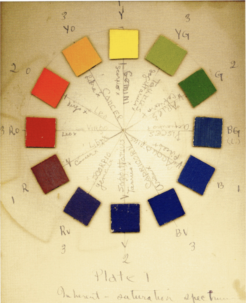
Artists’ color wheels provide the first guidance toward tempering the hue scale. Many color wheels are comprised of the six spectral colors orange, yellow, green, blue, violet and red, along with their six intermediate colors. This one was created by the painter Stanton Macdonald-Wright specifically to explore how musical harmony might inform color harmony.
Here is a modification of the hue space in which each of the twelve named chromatic colors occupies the same amount of space.

You will note that yellow has moved to the right, that the greens occupy about half the space they did. Clearly we have tossed out some of the information that used to be contained in the green part of the spectrum, and we have effectively slowed down our movement through what was the tightly packed orange-yellow through yellow part. But having the spectral colors equally spaced will produce substantial benefits when it comes time to combine colors and move through combinations of colors that have harmonious or discordant effects.
The code for the new controller is in the struct named TemperedHueRibbon in the file of the same name. It is essentially the same as that in the HueRibbon. The locations used in the gradient are changed to be evenly spaced and a call to spectrum.hsvLocationFromTemperedLocation converts the location of touch for globals.hueCenter when the DragGesture is used to move the thumb.
Balancing purity
A second issue is related to the relative saturation and brightness of colors. With the canvas as large as possible (by hiding all except the color panel) and the purity ribbon selecting its center value, move your finger slowly across the hue ribbon. You will notice that the canvas appears brighter as you move through the yellows, recedes through the blues, and rises again through the reds. The brightness in its part of the spectrum means that none of the greens looks like the color we generally associate with the name green. The simple, named color green usually looks more like the color that appears at 2 o’clock in Macdonald-Wright’s color wheel. Finally, the saturation of the blue and blue-violet hues appears deeper than that of any of the other colors.
We use the same basic trick we did with relocating the hues, which is to applying piece-wise modifications to the hsb-model, to adjust the saturation and the brightness. This involves peeling away a small amount of the color space, but in the name of producing a more consistent visual relationship among the colors.
The code for these is part of the Spectrum struct in ColorModel.swift. These routines take the location of the hue in hsv 0-1 space and return a multiplier that is applied to the saturation and brightness parameters when constructing tempered versions.
    func temperBrightnessFromHsvLocation( _ location:CGFloat) -> CGFloat {
         var brightness: CGFloat = 1.0

         if (location >= 0.15 && location <= 0.45) {
             var percent:CGFloat = 1.0
             if location < 0.30 { percent = (location - 0.15) / (0.30 - 0.15) * 0.15 }
             if location >= 0.30 { percent = (0.45 - location) / (0.45 - 0.30) * 0.15 }
             brightness = brightness * (1.0 - percent)
         }

         if (location >= 0.60 && location <= 0.90) {
             var percent:CGFloat = 1.0
             if location < 0.75 { percent = (location - 0.60) / (0.75 - 0.60) * 0.15 }
             if location >= 0.75 { percent = (0.90 - location) / (0.90 - 0.75) * 0.15 }
             brightness = brightness * (1.0 - percent)
         }

        return brightness
     }

     func temperSaturationFromHsvLocation( _ location:CGFloat) -> CGFloat {
         var saturation: CGFloat = 1.0

         if (location >= 0.28 && location <= 0.88) {
             var percent:CGFloat = 1.0
             if location < 0.58 { percent = (location - 0.28) / (0.58 - 0.28) * 0.2 }
             if location >= 0.58 { percent = (0.88 - location) / (0.88 - 0.58) * 0.2 }
             saturation = saturation * (1.0 - percent)
         }

         return saturation
     }
The tempered scale
These functions use piece-wise linear models to pull the saturation and brightness of the various hues closer to visually consistent. Together with tempering the hue locations, they are made to simplify the construction of color chords that produce similar harmonic effects even as arbitrary hues are positioned as the “tonic”. You can change these functions as you wish and when we get to user setting we’ll provide a switch for turning them off.
I will note in passing that a friend, an abstract painter who has observed Imager’s development over several decades, asked me at a demo last year if its color palette had become wider and more vibrant of late. I don’t know how common her experience is, but she has an excellent eye for color subtlety. If she was indeed seeing something, it is a consequence of this purity modification. And if that is the case, it should not be lost on us that the effect resulted from making parts of the spectrum narrower rather than wider.
The tempered versions are incorporated in the set of colors in the Colors.xcassets file and have been added to the color extension in ColorModel.swift. At the scale of a ribbon controller, there’s no visible difference between the two color sets, but we used them in the controllers for consistency.
A controller for discrete values of the twelve named colors is created by the struct TemperedHueKeys in the file of the same name.

Its code is straightforward.
struct TemperedHueKeys: View {
     let ribbonWidth:CGFloat
     let ribbonHeight:CGFloat
     @EnvironmentObject var globals: Globals

     var body: some View {
         HStack {
             HStack(alignment: .top) {
                 RoundedRectangle(cornerRadius:4)
                     .fill(Color .temperedRedOrange)
                     .frame(width:ribbonWidth / 12, height:ribbonHeight * 0.75)
                     .gesture(TapGesture().onEnded({
                        globals.hueCenter = spectrum.segments[0].hsvLoc
                     }))

...

                 RoundedRectangle(cornerRadius:4)
                     .fill(Color .temperedRed)
                     .frame(width:ribbonWidth / 12, height:ribbonHeight)
                     .gesture(TapGesture().onEnded({
                         globals.hueCenter = spectrum.segments[11].hsvLoc
                     }))
             }
         }
     }
 }
User settings
The SettingsPanel provides controls for selecting which of the three hue controllers is presented and for disabling the tempered purity adjustments.
class UserSettings: ObservableObject {
     @Published var hueController: Int {
         didSet {
             UserDefaults.standard.set(hueController, forKey: "hueController")
         }
     }

     @Published var purityAdjustment: Int {
         didSet {
             UserDefaults.standard.set(purityAdjustment, forKey: "purityAdjustment")
         }
     }

     init() {
         self.hueController = UserDefaults.standard.integer(forKey: "hueController")
         self.purityAdjustment = UserDefaults.standard.integer(forKey: "purityAdjustment")
     }
 }

 struct SettingsPanel: View {
     var hueControllers = ["Tempered hue ribbon", "Raw hue ribbon", "Tempered keys"]
     var purityOptions = ["Temper purity", "Maximize range"]
     @EnvironmentObject var userSettings: UserSettings

     var body: some View {
         VStack {
             Form {
                 Section {
                     Text("Color")
                     Picker(selection: $userSettings.hueController, label: Text("hueController")) {
                         ForEach(0 ..< hueControllers.count) {
                             Text(self.hueControllers[$0])
                         }
                     }
                     .pickerStyle(SegmentedPickerStyle())

                     Picker(selection: $userSettings.purityAdjustment, label: Text("purityAdjustment")) {
                         ForEach(0 ..< purityOptions.count) {
                             Text(self.purityOptions[$0])
                         }
                     }
                     .pickerStyle(SegmentedPickerStyle())
                 }
             }
         }
     }
 }
Just a couple more things were required to make use of all of this. In image_PerformerApp.swift, we need lines to set up userSettings to establish it as an environmentObject.
@main
 struct Image_PerformerApp: App {
     var globals = Globals()
     var userSettings = UserSettings()


     var body: some Scene {
         WindowGroup {
             ContentView()
                 .statusBar(hidden:true)
                 .environmentObject(globals)
                 .environmentObject(userSettings)
                 .background(Color .black)
         }
     }
 }
The ColorPanel needs to display TemperedHueRibbon, HueRibbon or TemperedHueKeys based upon the selection in the SettingsPanel and to present the purityRibbon only when there’s room.
struct ColorPanel: View {
     @EnvironmentObject var userSettings: UserSettings

     var body: some View {
         VStack {
             GeometryReader { geo in
                 if userSettings.hueController == 0 {
                     TemperedHueRibbon(ribbonWidth:geo.size.width * 0.6, ribbonHeight:geo.size.height * 0.35)
                         .offset(x:geo.size.width * 0.2, y:geo.size.height * 0.05)
                 }
                 else if userSettings.hueController == 1 {
                     HueRibbon(ribbonWidth:geo.size.width * 0.6, ribbonHeight:geo.size.height * 0.35)
                         .offset(x:geo.size.width * 0.2, y:geo.size.height * 0.05)
                 }
                 else {
                     TemperedHueKeys(ribbonWidth:geo.size.width * 0.8, ribbonHeight:geo.size.height * 0.9)
                         .offset(x:geo.size.width * 0.06, y:geo.size.height * 0.05)
                 }

                 if userSettings.hueController < 2 {
                 PurityRibbon(ribbonWidth:geo.size.width * 0.6, ribbonHeight:geo.size.height * 0.35)
                     .offset(x:geo.size.width * 0.2, y:geo.size.height * 0.5)
                 }
             }
         }
     }
 }
To make use of the temperedPurity adjustment, MetalView has code added into its clearColor() function.
            if parent.userSettings.purityAdjustment == 0 {
                 brightness = brightness * Double(spectrum.temperBrightnessFromHsvLocation(CGFloat(hue)))
                 saturation = saturation * Double(spectrum.temperSaturationFromHsvLocation(CGFloat(hue)))
             }
The MetalView2.swift file can be used to compare colors that have the adjustment with those that do not. It does not contain the code above so if you uncomment it in the CanvasPanel struct, the window will be split between a version that is adjusted and one that is not.
As of February 24, 2021